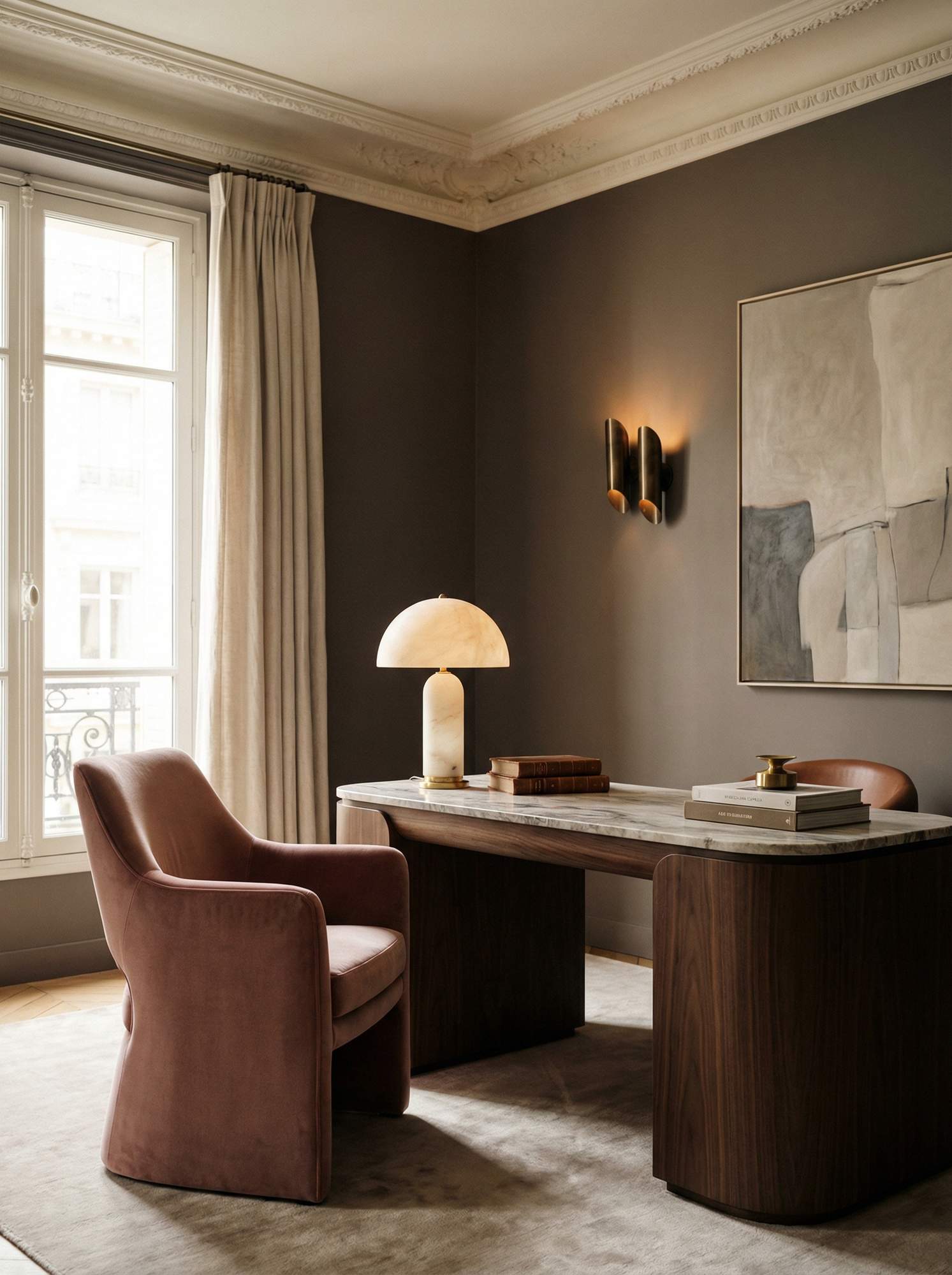
The first time I generated an AI interior image, I hated it.
It was technically fine. Bright, clean, composed. It also looked like every other AI interior image on the internet. The kind of thing that makes designers wince. Over-lit. Slightly plastic. Nobody's aesthetic in particular.
So I stopped treating it like a shortcut and started treating it like a brief.
That changed everything.
The Real Problem with AI-Generated Interiors
Most people approach AI image tools the way they'd approach a search engine. Type something in, see what comes back, pick the best one.
That's not how you'd approach a client project. You wouldn't hand a mood board brief to a junior and say "do something nice." You'd brief them carefully, specifically, with references and constraints and non-negotiables.
AI image generation works exactly the same way. The output is only as considered as the input. And right now, most people's inputs are vague.
This workflow fixes that.
The Workflow: Four Steps from Idea to Image
Step 1: Start with ChatGPT or Claude to explore your vision and build your prompt
Don't go straight to the image generator. Start with the vision.
Open ChatGPT or Claude and describe what you're trying to create. Not as a prompt, but as a brief. Talk to it the way you'd talk to a photographer or a set designer.
I'm creating visuals for a home office project. The client wants something feminine but not soft. Think Parisian professional. Moody walls, warm brass lighting, velvet somewhere. Not minimal, but restrained.
An additional option: the image route. Pull together two or three reference images that capture the feeling you're going for. They don't need to be interiors. They can be a fabric swatch, a film still, a photograph of light on a particular wall. What you're collecting is a mood, not a specification.
Then ask it to turn that brief into an image generation prompt tailored to your tool of choice. I use Nano Banana, but ChatGPT and Midjourney are also very strong options. Refine it. Push back on anything that sounds generic. Ask it to be more specific about materials, lighting direction, composition.
This step is where your design sensibility enters the process. The AI doesn't know your aesthetic. You have to give it one.
Step 2: Clarify your visual direction
Before you generate anything, pressure-test the prompt. Run through these four variables:
- Colour: specific tones, not "warm neutrals." Cocoa, warm grey, blush-brown.
- Materials: linen, lacquered stone, aged brass. Not "natural materials."
- Mood: what should this room feel like at 7am? At dusk? During a client presentation?
- Use case: is this for client concept visuals, your portfolio, or Pinterest content? Each needs a different composition.
This is the step most people skip. It's also the step that separates images that look like your work from images that look like everyone else's.
Step 3: Generate in Nano Banana (or Midjourney)
Paste your refined prompt into Nano Banana and generate three to five variations. Don't just take the first result. You're looking for the one that best captures the direction you briefed, not the most technically impressive image.
A note on this tool specifically: Nano Banana is accessible via Gemini or through a paid subscription to OpenArt.ai. Output quality for interior photography-style images is genuinely strong once it's given clear direction. Photorealistic, editorial, and far less likely to produce the uncanny results you get with other tools.
Step 4: Select and refine
Choose the strongest direction. Then iterate. Not from scratch, but by adjusting specific details in your prompt. If the lighting is wrong, describe the lighting you want. If the chair reads as too casual, specify the silhouette.
Think of this as you would a photoshoot. You don't reshoot everything because one prop is wrong.
What Makes a Prompt Actually Work
The difference between a prompt that produces something generic and one that produces something you'd actually use comes down to specificity in three areas:
Lighting direction. Not "warm lighting." Soft, diffused window light from the left. A single table lamp creating a pool of warmth. Overcast Irish daylight through generous glazing. These are not the same thing, and the AI knows the difference.
Texture layering. The best interior images, AI or otherwise, have depth. Velvet against stone. Paper against wood. Linen against brass. Build this into your prompt from the start.
Negative prompting. Tell the tool what you don't want. This is underused and high-impact. For a luxury home office prompt: no neon accents, no playful decor, no harsh contrast, no overtly theatrical styling. You're not just directing toward something. You're directing away from everything that dilutes it.
Where These Images Go Next
This workflow isn't just for concept visuals. Once you have a library of on-brand AI-generated images, the use cases multiply:
- Client presentations: concept direction before committing to a scheme
- Your portfolio: especially useful if you're between projects or building in a new aesthetic direction
- Pinterest content: high-performing pins that drive traffic back to your work
- Social media and Reels: scroll-stopping visuals that look editorial, not amateur
This Is Just the Beginning
AI image generation is moving fast. The tools are getting better, the prompts are getting more sophisticated, and designers who understand this workflow now will be significantly ahead of those who discover it in two years.
I write about this kind of thing regularly: practical AI workflows for small creative businesses, without the hype and without the overwhelm. No guru energy. Just honest, considered guidance from someone building in real time.
The prompt is just the starting point. Your direction is what makes the result feel considered and high-end.